You don’t need a complex exhibition stand design to attract attention at a trade show; sometimes, simple ideas work the best.
Here are a number of straightforward exhibition stand ideas which have successfully raised the brand awareness of some of our clients:
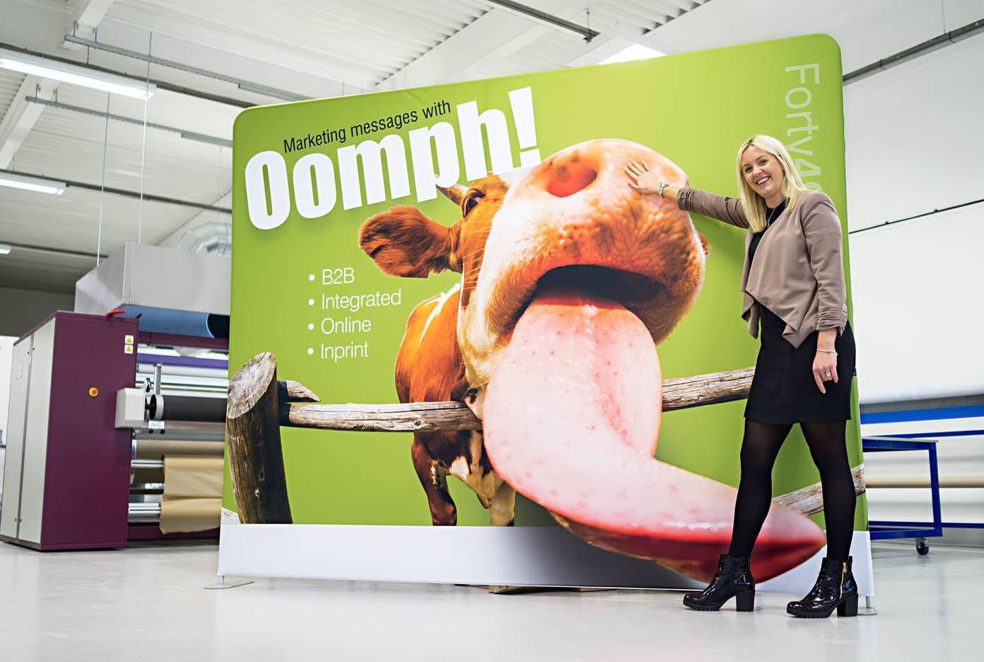
This Formulate straight fabric exhibition stand for Forty49 is extremely eye-catching and highly effective, and there’s nothing complicated about it.
The main element of this exhibition stand is the high-quality image. Forty49 carefully selected a photo that they knew would appeal to their target audience. It’s spontaneous, loud and bold, but most importantly, it works.
There are eight words (not including the logo) on the entire display – just enough to show people what the company does and the services it provides, but little enough so that people still have to come over and engage with the team to find out more.
By simply layering a plain background with a high impact image, a little bit of text and a logo, Forty49 have created a superb display that will make people stop in their tracks and take a second look.
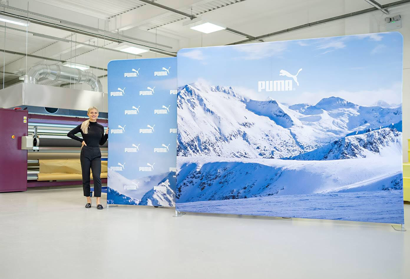
Exhibition stand design doesn’t get much simpler than these two Formulate straight fabric displays for Puma.
With a brand as big and recognisable as Puma, the logo does more than any complex graphic design ever could, but you don’t have to be a global brand for a design like this to work.
Selecting the right imagery is key. The background on these two displays makes you question what the company is promoting – is it ski gear? Mountaineering clothing? This curiosity is what will drive event visitors to your exhibition stand and engage with you and your team.
Engagement with your team is engagement with your brand, and it gives you the chance to use your knowledge and expertise to really sell yourself and show people what you can do.
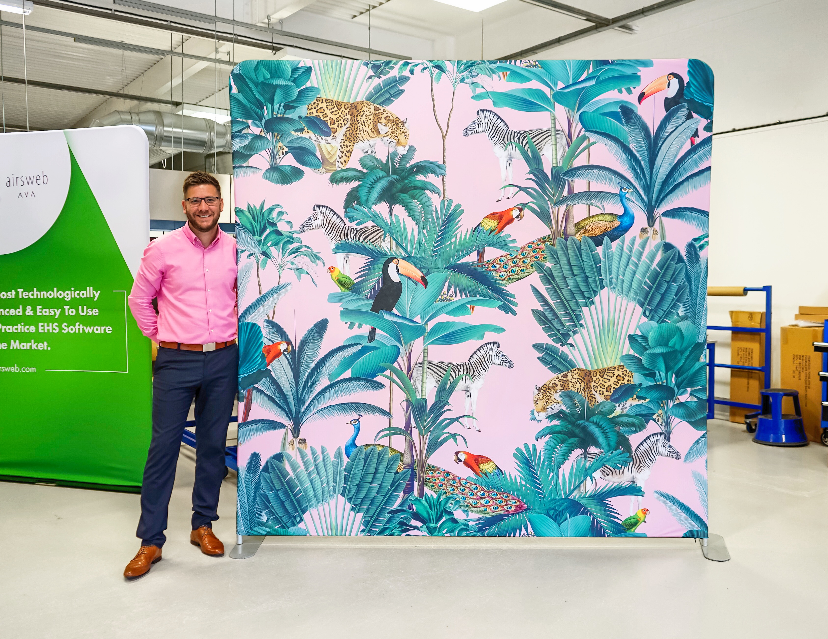
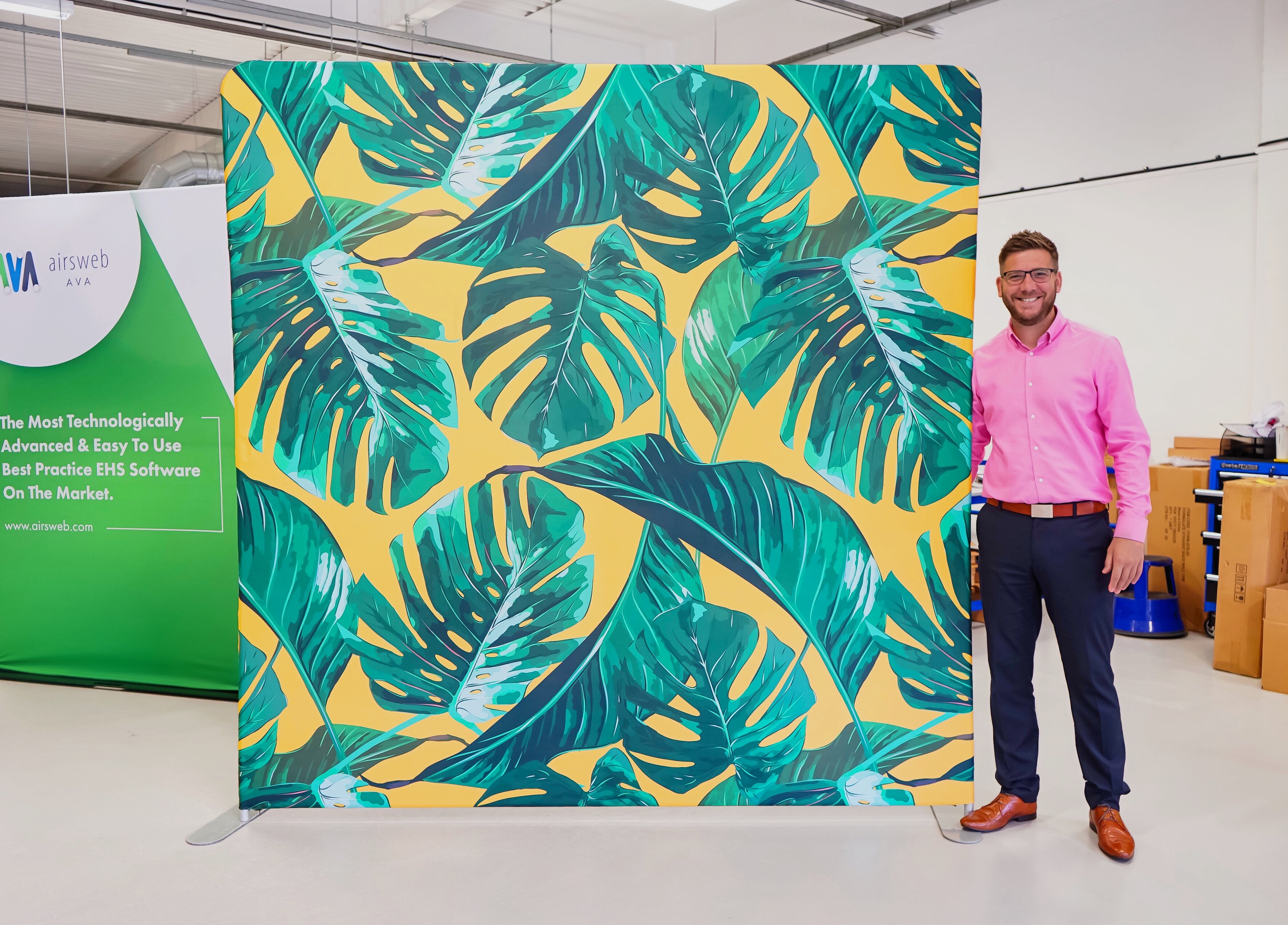
These two fabric displays don’t have any text on whatsoever because they were designed to be used as a photo booth background at weddings and parties.
The vibrant design is the perfect backdrop for people to take selfies in front of and is the kind of thing you would see shared on social media frequently.
Getting visitors to engage with your business online is a great way to boost your brand awareness, and giving people the chance to take a fun photo is a sure-fire way to get people to talk about your brand online.
If you have enough exhibition space, it might be worth looking to include a simple back wall for people to take photos in front of. You could even make a competition out of it and drive traffic to your stand that way. It’s a simple but effective way of getting yourself noticed by a larger audience.
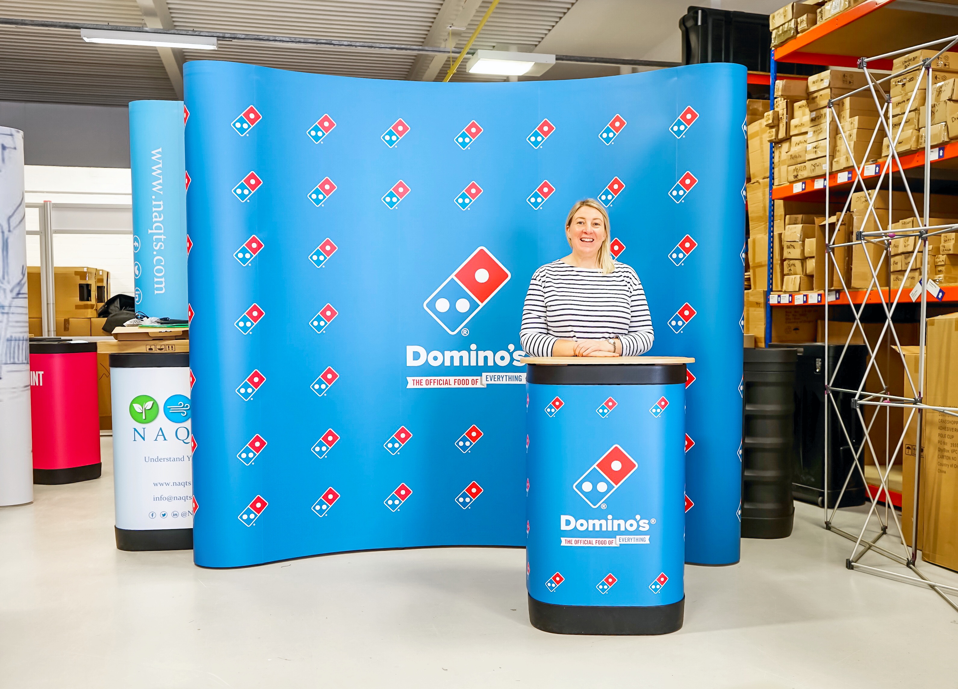
This pop up exhibition stand for Domino’s is a prime example of how less is more. They have kept it extremely simple and understated by only using their logo and the colours on it.
This is a great technique for building up brand recognition, and it requires no excess creativity because it’s using what you already have.
Step and repeat graphic designs are always a solid choice because they make excellent photo back walls and have long attracted attention at trade shows. This type of pattern works particularly well for small exhibition spaces because it’s not too loud and won’t make the space appear smaller than it is.
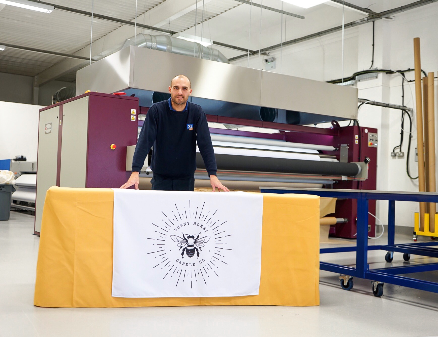
Simple exhibition design stretches further than just large display stands. Printed tablecloths are an immensely popular product that thousands of businesses rely on to promote their brand.
They have a relatively small surface area and so complex designs don’t naturally sit well on them. In fact, the less design there is, the better the tablecloth will look.
The printed table runner above looks so sharp and classy because of its simplicity. An oversized logo on a white background contrasted nicely against a mustard conference cloth is the perfect combination for a niche brand, but the elegance of the combination can work for any business.
These are just a few examples of simple exhibition stand design.
There are no set rules to graphic design - what works for your brand won’t work for another – but there are a handful of general tips that can be taken away and used in a minimalistic design.
1. Colours
Stick to your brand’s key corporate colours. The world’s biggest brands are recognisable because they stick to what they know. They use the same colours, the same logos and the same straplines in their marketing materials. Doing so means that they have built up a recognisable business model that is known the world over.
Whilst your business may not be in the market for international trading, being recognised in your industry is key to building a reputation.
2. Imagery
We frequently mention how much impact the right image can have, and it has been perfectly demonstrated with the displays above.
Selecting a high definition photo will instantly capture people’s attention at an exhibition and draw them to your stand. It’s a great way to market your business and will work really well if you’re looking to create a photo backdrop.
3. Branding
If a large photo isn’t your bag, a step and repeat pattern might just be the solution you’re looking for.
It’s a great way for start-up brands to get their logo recognised, and it works extremely well as a photo booth wall, too.
Step and repeat patterns are easy to create and so won’t break the bank. They’re an excellent way to differentiate your business from the next.
4. Text
We never recommend people use too much text on their exhibition stands. It looks messy and is often wasted because most people won’t stop to read it. Exhibition stands aren’t designed to showcase your brand’s life story, and that’s why so many text-heavy displays fail.
Keep text to an absolute minimum to maximise your chances of getting noticed. Mention who you are and what you do, but leave enough information out to encourage visitors to come over and talk to you face-to-face.
These are just a few of the simple graphic design tips we recommend. For more information, contact us or call 01733 511030.
Permalink:
https://www.xldisplays.co.uk/news/simple-exhibition-stand-design.aspx